Technis offers integrated overview reports for each of your sites, providing a overview of their performance. To take your analysis further, you can modify the summary report or create brand new custom reports.
All changes you make are saved automatically.
To start creation a new report, navigate to Reports and click New report.
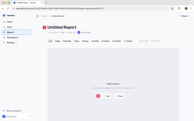
From here you can:
- Add a title of your report and pick an icon
- Start adding different charts, visualizations or text
- Build a chart by describing it with Ask Technis
Build with Ask Technis
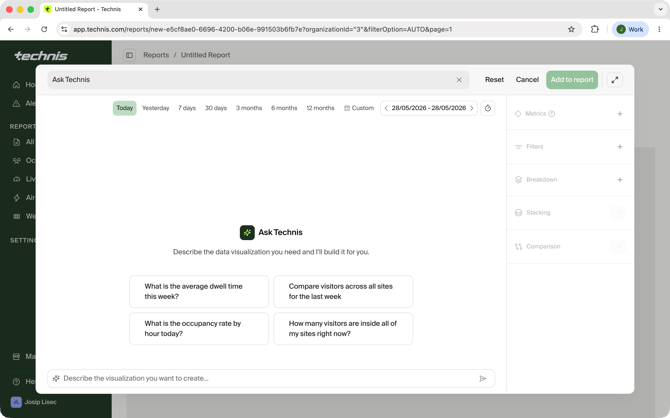
Ask Technis is a great way to get started with creating custom charts - you simply describe the data you're looking for and we'll take care of picking the best metrics, chart type and appropriate filters.
Example questions you can ask:
- What's the average occupancy of the meeting rooms?
- Compare visitors on Site A with Site B
- Which hours were the busiest this week?
Chart builder understands your sites topology, helping you narrow the data with follow up questions such as:
- what about only sites in Switzerland?
- include only meeting rooms in Lausanne
- add breakdown by zone
To fully customize your charts, keep reading on this guide to better understand how chart configuration works.
You can also edit existing charts using natural langauge, click on Tweak when editing a chart top of any chart.
Adding charts
When adding a new chart, start by choosing a metric you want to display. After selecting the metric you will be able to configure other details.
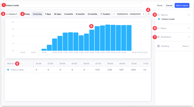
From this screen you can customize different aspects of your chart:
- Chart name, it will be displayed in the report.
- Visualization type, for example column, bar or pie chart.
- Time span, for which the data is displayed, for example today or last 3 months.
- Time grain, defining how detailed the data will be.
- Metrics to be displayed.
- Filters, allowing you to narrow down displayed data to only certain sites, zones or passages. By default data for all the sites in your organization is displayed.
- Breakdown, to view your data grouped by a property such as site, zone or passage.
- Chart preview, this section shows the preview of the data as it will appear in the report once saved.
- Chart data, a tabular view of the data displayed by the chart. When exporting the report to XLSX the chart will be exported in this format.
There may be additional options based on the type of the visualization selected.
Visualization
Clicking on (2) Column, you can switch between different visualizations. See a list of supported visualizations.
Time span
Each chart has its own time range assigned to it. When selecting any of the pre-defined time frames (today, yesterday, 7 days, etc.) the data will be updated dynamically each time somebody opens or exports a report.
When selecting a custom time span, the selected dates will be always displayed and won’t be refreshed.
You can select dates in the future, for example when preparing a report for an event in advance.
Time grain
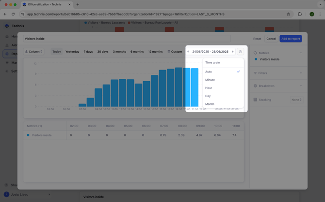
Time grain controls the smallest unit of time that will be displayed by the chart. By default the time grain adopts to selected time span. Available options include:
- Auto: time grain will be selected automatically based on the selected time span.
- Minute: data is displayed per minute. Works best for a time span of a few hours.
- Hour: used automatically for time spans that are less than 24h.
- Day: used automatically for time spans between 2 and 30 days.
- Month: used automatically for time spans longer than 30 days.
Metrics
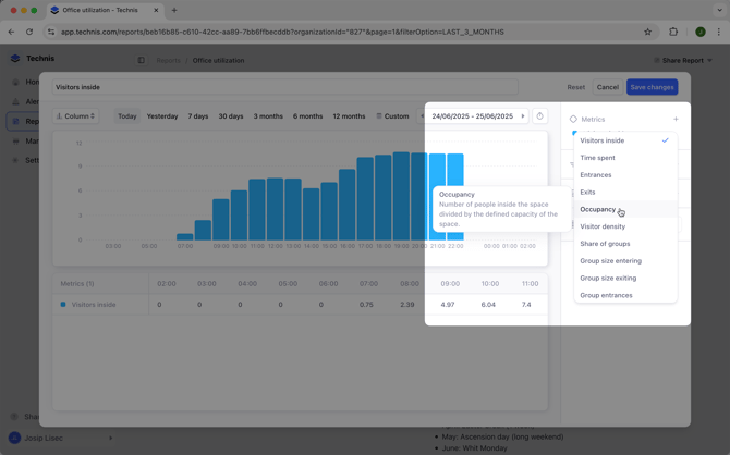
Charts can display multiple metrics, to add a new one or remove an existing one, click on the Metrics section. Next to each metric a description displays how the value is calculated or what it represents. See the list of all supported metrics.
Metric customization

Once a metric is added to your chart, clicking on it lets you customize further details:
- Label: clicking on the metric name you can rename it.
-
Time aggregation: which determines if the displayed valus are averages, sums or local maximums in the selected time grain.
- Filters: additional filtering options for each metric, they can differ from global filters (see below)
Filters
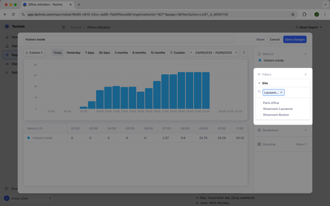
Without a filter, charts display aggregated data across all of your sites. To narrow down the data to a specific site, or other Filters allow you to narrow down the displayed data.
Data can be filtered by:
- Site
- Zone, requires a site filter
- Passage, requires a site filter
- Device
- Group
- Gender, requires devices capable of identifying different genders
- Age, requires devices capable of identifying different age groups
- Type of day, for example to include only Mondays and Wednesdays in a chart
For example, to display data only for one site you can:
- Click on Filters
- Select Site from the dropdown
- Select the site you are interested from the dropdown
Breakdown
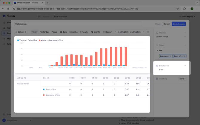
Unlike Filters which let you narrow down the data, breakdown groups the results of your queries by a property. This allows you to examine impact of each property individually.
Data can be broken down by:
- Site
- Zone
- Passage
- Device
- Gender
- Age
- Type of day
For example, looking at a "Visitors inside" metric reveals an aggregated number of visitors across all your sites. Adding a "Site" breakdown allows you to see how many visitors there are in each site (see screenshot above).
Breakdowns require a filter of the same type to be active. Zone and Passage breakdowns additionally require a Site filter.
Adding text
You can add free-form text anywhere on the report. With the help of formatting options, use it to create sections, add explanations or links to other reports or resources.
Known limitations
- When using breakdowns, only one metric is supported.
- Only one breakdown is supported.
- When Group filter is active, breakdown by site/zone/passage and device are disabled.