When creating custom reports you can choose between a number of visualizations. This article document supported visualizations, additional options and tips on when to use each one.
Jump to: Column • Bar • Line • Area • Pie • Heatmap • Big number • Table • Ranking • Funnel • Scatter plot • Floor plan • Multisite map • Energy label
Column chart
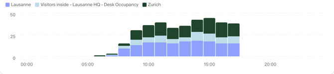 Column chart (or a vertical bar chart) works especially well for time series with only a few dates, as there is limited space on the X axis.
Additional options: Stacking
Stacking is ideal to present proportions of categories, providing an easy comparison.
When displaying multiple metrics or using a breakdown you can choose different stacking methods:
- None, each data series is shown separately
- Standard, series are added up (see example chart above)
- 100%, values of each series are represented as percentage of the total sum.
Additional option: Comparison
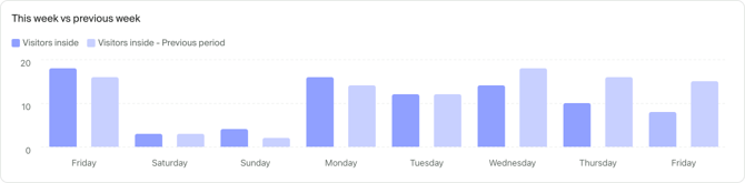
In addition to breakdown that allows you compare different entities such as sites or zones one to another, you can compare your data in time using the Comparison option.
Time comparison is great for contextualizing your data and helping you guide your business trends and decisions.
Comparison supports three modes:
- None, the default option with comparison disabled.
- Previous period, data from the selected time frame is compared to the previous period of the same duration (ie. this week compared with previous week)
- Custom period, where you can compare selected time frame with any other point in time of the same duration.
The data for ongoing day will be compared to the same minute in previous period. In the screenshot above, in the data for August 29 the compared value is the one of 22 Aug at the time screenshot was taken.
Bar chart
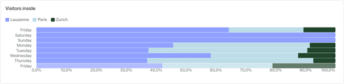
Bar chart (or horizontal bar chart) works well for time series with more time series and is useful for looking at data on a daily basis between multiple categories.
Additional options: Stacking
Stacking is supported by bar charts. See how stacking works.
Line chart
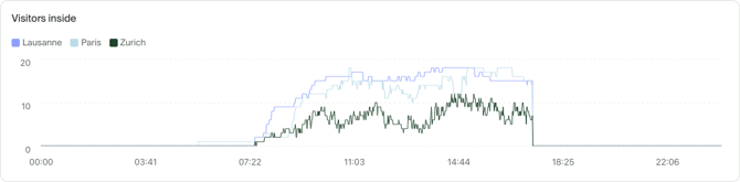
Line charts are ideal if you want to show trends and developments over time, especially for changes that are measured continuously (such as entrances and exits). A line chart can help you visually identify trends and patterns at a glance.
Additional options: Stacking
Stacking is supported by line charts. See how stacking works.
Area chart
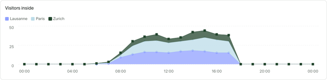
Use area charts if you want to show how values develop over time, if the total number is important as individual categories and there is substantial difference between values of each category. If you want to show how values differ in different categories, use a bar or column chart instead.
Additional options: Stacking
Stacking is supported by area charts. See how stacking works.
Pie chart
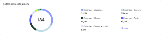
Pie charts are a great way to show proportional parts of a whole. A readable pie chart should not have too many slices and the differences between them should be significant. If you want to show a share between two values (for example gender or age category), simple text or bar chart may be better.
Pie charts can display only one metric at a time.
Heatmap
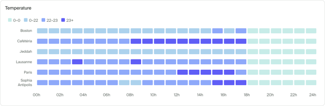
Heatmap can help you spot patterns in your data by grouping and representing your data with colors of different intensity. It's most useful when paired with a zone or passage breakdown.
Your data is automatically distributed into 4 groups based on the minimum and maximum values in your data set. The data is always shown with a 2 hour granularity. If you select multiple days, the average values for across selected days will be displayed.
Heatmap can display only one metric at a time.
Big number

Big number visualization displays a single metric in an easy-to-ready format. It's best used to provide summaries at the top of your report wither with live data or aggregate over time.
Additionally, you can display a trend indicator, comparing the current value with that of the previous period. For example, when looking at data for last 7 days, the comparison will show the trend compared to the period that started 14 days ago.
Big number can display only one metric at a time.
Additional options: aggregation
By default, big number displays the latest value from the selected time span and time grain. To customize the displayed value you can use the Time aggregation setting to customize this.
Supported aggregation methods are:
- Latest value (default setting)
- Average
- Sum
- Maximum
- Minimum
In addition to time aggregation, you can also customize Entity aggregation. If you're displaying data for multiple sites, zones or passages you can define how the data between them will be calculated. By default the same method as the Time aggregation is used.
Configuration examples
To display the maximum daily value for the past month, you can select:
- Time span: Last 30 days
- Time grain: Daily
- Time aggregation: Maximum
- Entity aggregation: Auto
To display the latest up-to-date value:
- Time span: Today
- Time grain: Minutely
- Time aggregation: Latest value
- Entity aggregation: Auto
To display current total number of visitors inside across 3 sites:
-
Time span: Today
- Time grain: Minutely
- Time aggregation: Latest value
- Entity aggregation: Sum
You can display up to three Big number visualizations to the same row by dragging and dropping them next to each other when looking at a report.
Table
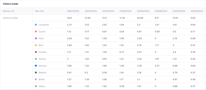
The table visualization shows you precise values of your data and allows you to quickly compare or scan either multiple metrics or a breakdown category.
Additional options: rows and columns
You can customize the layout of your table by choosing which data appears in rows and columns respectively. Supported options are:
-
Metrics
-
Time
- Breakdown: available only if there is an active breakdown
By swapping selected values for Rows and Columns you can transpose content of the table as it best fits your needs.
Pivot table
To get quick a summary of multiple metrics from multiple sites or zones, create a pivot table by combining different features of the table visualization.

1. Select metrics you want to include in the table. Customize each metric further for different aggregation or filters. Click on the metric's name to change its label.
2. Select sites/zones/passages to include
3. Add a breakdown
4. For Rows, select Breakdown
5. For Columns, select Metrics
You can select data from the table, copy it and paste directly into Excel or Google Sheets to perform additional analysis.
Ranking

Use the Ranking chart to quickly compare categories and highlight the top items, such as seeing the most visited zones in your space. You can toggle the sorting order to view top-to-bottom or bottom-to-top rankings.
Scatter plot

A scatter plot is perfect for showing the relationship between two quantitative measures. Each dot on the coordinate grid represents a value from two categories. It can help you spot the correlation of two metrics.
To configure the scatter plot you need to define:
- X axis metric
- Y axis metric
- Breakdown by site or zone that will determine each bubble
- Optionally, bubble size metric
The chart displays one bubble per item of breakdown.
Funnel

Funnel chart lets you visualize the conversion funnel of your business, weather it's moving through a specific set of zones or completing checkout in a shop .
Funnel can contain any number of steps, where each step is defined by:
- Name of the step
- Primary metric that's used to display the funnel curve
- Secondary metrics that are displayed when clicking on any of the steps.
- Associated location that's used to pull the data, such as site or a zone.
- Additional steps, at least two are required.
Additionally, you can enable comparison with a previous period on the chart or switch between Linear and Logarithmic scale.
Floor plan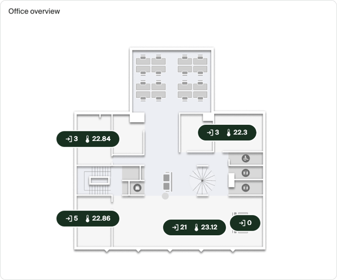
The floor plan visualization is great for displaying your live and historical data on top of a floor plan of your space.
Multiple metrics are displayed on the map of your space, displaying either:
- Latest value for the metric when looking at today
- An average or sum when looking at multiple days
This visualization respects the selected time grain, similar to the Big number visualization.
Before adding it to a report, you have to upload and configure a floor plan in Sites for each of your zones.
Multisite map

Visualize your complete portfolio of sites in a single map. Use it to keep an eye on key metrics across sites that are geographically distributed, such as large-scale events, a country-wide network of shops or buildings.
The map can be configured with:
- Any number of sites: Note that some existing sites may require you to re-enter their exact address to be positioned on the map.
- A floor plan of the site: When zoomed-in on street-level a floor plan can be displayed and positioned over the world map.
- Primary metric: this metric is used to color-code the pins of your sites when the map is zoomed out.
- Secondary metrics: up to 4 additional metrics that are displayed in the sidebar or on the map by using the toggles at the top of the map.
- Alert history: list of recently triggered alerts for any of the sites displayed on the map.
When added to a report, additional controls are available for switching to a table mode as well as filtering and searching sites.
Tip: Use Share for TV to display the map on a TV in your office or control center.
Energy label

Use the energy label to visualize your building's or your entire portfolio's energy efficiency in the past 12 months in your reports.